full credits to the original maker!
all opinion's are appreciated!
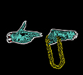
V:1

V:2

V2: is a work in progress, although I've already scrapped it
EDIT: Posted in here because graphics section is beyond dead!
![]() by sandro » Feb 5th, '14, 10:12
by sandro » Feb 5th, '14, 10:12


![]() by sandro » Feb 5th, '14, 10:35
by sandro » Feb 5th, '14, 10:35
![]() by CanadaPure » Feb 8th, '14, 10:14
by CanadaPure » Feb 8th, '14, 10:14


![]() by StanBase » Feb 8th, '14, 10:51
by StanBase » Feb 8th, '14, 10:51

Rollefsen wrote:this guy is THE Spongebob.
Menzo wrote:one of my lowkey favourite 'newcomers' atm.
cement wrote:youre that real nikka


![]() by sandro » Feb 8th, '14, 11:53
by sandro » Feb 8th, '14, 11:53
CanadaPure wrote:I prefer the one we have now because it's clean and simple, but that's not to take away from your work. V1 is a lot nicer to me, V2 has a little bit too much going on for my taste.
Also, I've moved this to graphics anyways, because Speak on Shady Sites is equally if not more dead.
![]() by sandro » Feb 8th, '14, 11:53
by sandro » Feb 8th, '14, 11:53
StanBase wrote:Good job bro
![]() by StanBase » Feb 8th, '14, 13:32
by StanBase » Feb 8th, '14, 13:32
Rollefsen wrote:this guy is THE Spongebob.
Menzo wrote:one of my lowkey favourite 'newcomers' atm.
cement wrote:youre that real nikka
![]() by sandro » Feb 8th, '14, 14:30
by sandro » Feb 8th, '14, 14:30
StanBase wrote:^I agree v2 is a little too much, but both looks good
![]() by HeySamantha » Feb 8th, '14, 14:34
by HeySamantha » Feb 8th, '14, 14:34


![]() by sandro » Feb 8th, '14, 15:23
by sandro » Feb 8th, '14, 15:23
HeySamantha wrote:I really like them both, V1 the most. It gives the current banner a little "umph!" a little more something to catch the eye.
I doubt we'll be having banner changes anytime soon. Not only because this one is fairly new, but almost all banners would look weird with how this layout is set up. I'd be easier to change and look proper if the "Messages", "Profile" and "Log Out" buttons were down where the "FAQ", "Search" ect were.

![]() by HeySamantha » Feb 8th, '14, 16:23
by HeySamantha » Feb 8th, '14, 16:23
![]() by sandro » Feb 9th, '14, 02:41
by sandro » Feb 9th, '14, 02:41
HeySamantha wrote:The layout was recently changed and it looks way better than it did, and although the banner is nice as it is, it's just in a weird spot. It could have been twice the size it is and moved the "profile" ect buttons down on the black menu bar.
Users browsing this forum: No registered users