
Not digging the logo.
67 posts
• Page 2 of 5 • 1, 2, 3, 4, 5
Re: Not digging the logo.
![]() by irfman » Sep 28th, '10, 15:43
by irfman » Sep 28th, '10, 15:43
Too much purple, doesn't go with the rest of the forum.
Motherfuckers, say that I'm foolish I only talk about jewels
Do you fools listen to music or do you just skim through it? - Jay Z
Do you fools listen to music or do you just skim through it? - Jay Z
-

irfman - Soldier

- Posts: 628
- Joined: Jan 15th, '05, 20:01
- Location: London, UK
- Gender: Male
Re: Not digging the logo.
![]() by electroencephalogram » Sep 28th, '10, 15:52
by electroencephalogram » Sep 28th, '10, 15:52
Looks like someone can use all the cool photoshop effects but doesn't know the first thing about good design. Shadows, blurs, transparencies, you never see that crap on professional design.
A drop shadow on text? is this 1998?
A drop shadow on text?
is this 1998?
-

electroencephalogram - Soldier
- Posts: 1059
- Joined: Jun 10th, '09, 20:43
Re: Not digging the logo.
![]() by OMEGA » Sep 28th, '10, 15:57
by OMEGA » Sep 28th, '10, 15:57
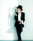
Just out of curiosity, would you guys rather have this banner instead?


-

OMEGA - Under The Influence

- Posts: 4003
- Joined: Nov 25th, '09, 01:34
Re: Not digging the logo.
![]() by Raids-God » Sep 28th, '10, 16:00
by Raids-God » Sep 28th, '10, 16:00
This Banner give me Chils in my bullsack ...
just saying
just saying

-

Raids-God - Role Model

- Posts: 3539
- Joined: Jan 29th, '10, 22:51
- Location: The Naxteratem of Raids god
- Gender: Male
Re: Not digging the logo.
![]() by Alaine » Sep 28th, '10, 16:03
by Alaine » Sep 28th, '10, 16:03
Omega wrote:Just out of curiosity, would you guys rather have this banner instead?
I like this one, great pic & simple background, the text would look cooler straight though
hmm but the color doesn't go with the forum color
-
Alaine - Band Leader

- Posts: 5635
- Joined: Sep 18th, '09, 21:31
- Gender: Female
Re: Not digging the logo.
![]() by OMEGA » Sep 28th, '10, 16:07
by OMEGA » Sep 28th, '10, 16:07
Imo, the forum would look sick if the administration changed the color of the hyperlinks to blue. I always thought the redish was associated with the Relapse era, and now that we are during Recovery, post Recovery, it should be blue. Just my 2 cents 
Here´s a mockup

I made the text go diagonal because is parallel to Em´s finger.
Here´s a mockup
I made the text go diagonal because is parallel to Em´s finger.
Last edited by OMEGA on Sep 28th, '10, 16:07, edited 1 time in total.
-
OMEGA - Under The Influence
- Posts: 4003
- Joined: Nov 25th, '09, 01:34
Re: Not digging the logo.
![]() by Alaine » Sep 28th, '10, 16:11
by Alaine » Sep 28th, '10, 16:11
Omega wrote:Imo, the forum would look sick if the administration changed the color of the hyperlinks to blue. I always thought the redish was associated with the Relapse era, and now that we are during Recovery, post Recovery, it should be blue. Just my 2 cents
Here´s a mockup
I made the text go diagonal because is parallel to Em´s finger.
I'd like to see some changes as well-
Alaine - Band Leader
- Posts: 5635
- Joined: Sep 18th, '09, 21:31
- Gender: Female
Re: Not digging the logo.
![]() by electroencephalogram » Sep 28th, '10, 16:12
by electroencephalogram » Sep 28th, '10, 16:12
a camel is a horse designed by a committee
-
electroencephalogram - Soldier
- Posts: 1059
- Joined: Jun 10th, '09, 20:43
Re: Not digging the logo.
![]() by OMEGA » Sep 28th, '10, 16:16
by OMEGA » Sep 28th, '10, 16:16
I made another mockup:

IMO looks dope as fuck
IMO looks dope as fuck
-
OMEGA - Under The Influence
- Posts: 4003
- Joined: Nov 25th, '09, 01:34


-

EminemBase - Addict
- Posts: 10007
- Joined: Dec 10th, '09, 06:37
- Location: Inside your mind famalamalamalam.
- Gender: Male
Re: Not digging the logo.
![]() by EminemBase » Sep 28th, '10, 16:47
by EminemBase » Sep 28th, '10, 16:47
electroencephalogram wrote:Looks like someone can use all the cool photoshop effects but doesn't know the first thing about good design. Shadows, blurs, transparencies, you never see that crap on professional design.
A drop shadow on text?
True that, that's a major downfall of it.
But the overall effect I think is nice. But yeah, shadow-text
 , lmfao.
-
EminemBase - Addict
- Posts: 10007
- Joined: Dec 10th, '09, 06:37
- Location: Inside your mind famalamalamalam.
- Gender: Male
Re: Not digging the logo.
![]() by xRas » Sep 28th, '10, 16:49
by xRas » Sep 28th, '10, 16:49
thatonethatonethatone!!!BronekPoland wrote:What about that one:
-

xRas - Renegade

- Posts: 2716
- Joined: Aug 9th, '09, 00:38
- Location: Shit hole
- Gender: Male
Re: Not digging the logo.
![]() by Raids-God » Sep 28th, '10, 16:59
by Raids-God » Sep 28th, '10, 16:59
Menzo wrote:BronekPoland wrote:What about that one:
That one looks pretty fuckin sick.
Ok This one Litratly Throws my balls into the Sky

just saying
-
Raids-God - Role Model
- Posts: 3539
- Joined: Jan 29th, '10, 22:51
- Location: The Naxteratem of Raids god
- Gender: Male
67 posts
• Page 2 of 5 • 1, 2, 3, 4, 5
Return to Speak on Shady Sites
Who is online
Users browsing this forum: No registered users