Slimm wrote:I think a banned should be quiet, and not full with special effects
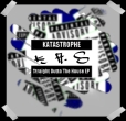
With Proof:
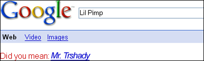
Without proof:
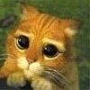
Failed attempt:
@ Asperine
I like yours


i like the glossines feel in the last one but there are usless items there in the background that spoil it
the 2nd one looks most on point, proof is just too pink lol. If u can choose a thicker font for TRshady would be even greater


 nice job


 i like slimm's better


 is there gunna be like a voting thingy in which ones the best