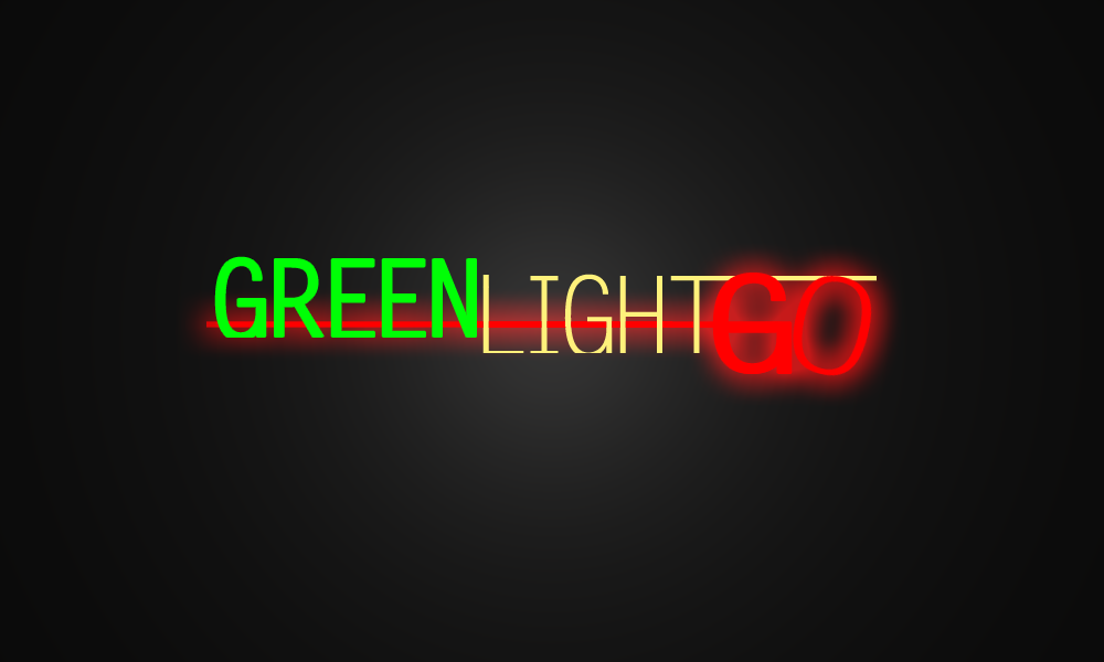
http://i42.photobucket.com/albums/e315/ ... GLogo1.png
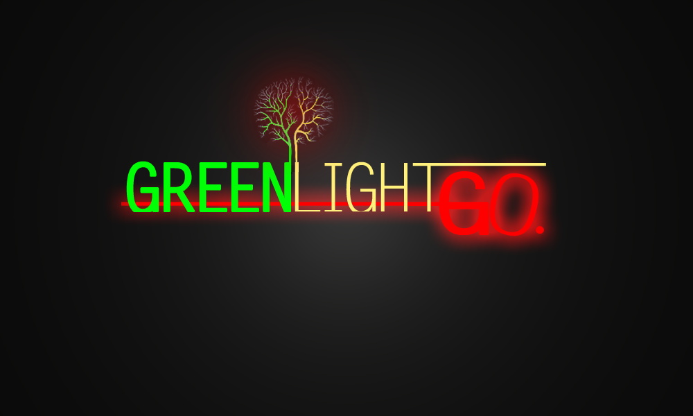
http://i42.photobucket.com/albums/e315/ ... GLogo2.png
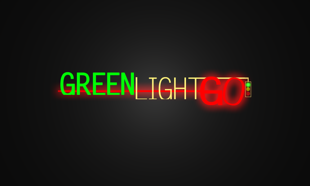
http://i42.photobucket.com/albums/e315/ ... GLogo4.png
Which one do you like best? Any improvements I can make?
![]() by theJFKshow » Oct 21st, '09, 08:52
by theJFKshow » Oct 21st, '09, 08:52

![]() by TRshady » Oct 21st, '09, 09:43
by TRshady » Oct 21st, '09, 09:43


![]() by embm » Oct 21st, '09, 17:10
by embm » Oct 21st, '09, 17:10


![]() by gutawafang » Oct 22nd, '09, 03:43
by gutawafang » Oct 22nd, '09, 03:43


![]() by Xray » Oct 22nd, '09, 09:49
by Xray » Oct 22nd, '09, 09:49


![]() by B.A.D. » Oct 22nd, '09, 18:59
by B.A.D. » Oct 22nd, '09, 18:59
TRshady wrote:Good work right there, I'd say first is best and would work best as a logo.
Liking the slick style, only change I'd make it to tone down the 'GO', the red overglow is a little overpowering.

Dr.Dre wrote:Hell Yeah


![]() by DƎRDYPK » Oct 22nd, '09, 19:01
by DƎRDYPK » Oct 22nd, '09, 19:01
Angie wrote:i like the 3rd one best
![]() by °[~CHR!$~]° » Oct 22nd, '09, 19:54
by °[~CHR!$~]° » Oct 22nd, '09, 19:54


Users browsing this forum: No registered users